


What Makes a Banner Design Actually Work?
A banner that gets attention does one thing well: it communicates a single clear message to someone who wasn't looking for it. That person is driving past at 35 miles per hour, walking by while checking their phone, or scanning a trade show floor with 200 competing displays in view. They give your banner 2–3 seconds of attention — maybe less. In that window, your banner either registers or it doesn't.
Most banner design mistakes come from treating a banner like a flyer or a website — adding too much information, using text that's too small to read from a distance, and prioritizing completeness over clarity. A banner is not a document. It is a signal. The design principles that make a banner work are fundamentally different from the principles that make other marketing materials work, and understanding that difference is the starting point for every effective banner.
The test for any banner design is simple: stand at the actual distance the banner will be viewed from and read it in 3 seconds. If you can't read it clearly and understand the message in that time, the design needs to change — regardless of how good it looks in a proof on a computer screen.
Rule One: One Message Per Banner
The single most impactful design decision you can make for any banner is committing to one primary message and removing everything that competes with it. Every element added to a banner dilutes the visibility of every other element. A banner that tries to communicate five things communicates none of them effectively.
Identify the One Thing You Need the Viewer to Know
Before opening any design software, answer this question in one sentence: what is the single most important thing someone who sees this banner should take away? "We are now open." "Everything is 40% off this weekend." "Our booth is at aisle 7." That one sentence is your primary message. Everything in the design either supports that message or dilutes it. Anything that dilutes it should be removed or made significantly smaller than the primary message.
Establish a Clear Visual Hierarchy
Visual hierarchy is the order in which a viewer's eye moves through a design. On a well-designed banner, the hierarchy is intentional: the most important element is the largest and highest contrast, the second most important is noticeably smaller, and everything else is smaller still. If all elements are the same visual weight — same size, same color, same contrast — the viewer's eye has no entry point and the entire banner reads as visual noise. Size and contrast are the two primary tools for creating hierarchy on a banner.
Limit Text to What Fits at Legible Size
A useful discipline for banner design: write out your complete intended message, then ask what can be removed without changing the core meaning. "Come visit us at our grand opening this Saturday and Sunday from 10am to 6pm and enjoy free refreshments and special offers" becomes "Grand Opening — Sat & Sun 10–6 — Free Refreshments." The second version communicates the same information in a fraction of the words and can be set at twice the size for the same banner area. Every word you remove from a banner allows every remaining word to get bigger and more readable.
Text Size and Readability at Distance
Text size is where most banner designs fail. What looks large on a 27-inch monitor at 100% zoom is often completely illegible at the actual viewing distance of the installed banner. Designing for the screen rather than the installation distance is the most common and most costly banner design mistake.
| Viewing Distance | Minimum Letter Height | Typical Context |
|---|---|---|
| 10 feet | 1 inch | Indoor trade show, point of sale, retail interior |
| 25 feet | 2.5 inches | Storefront pedestrian traffic, event entrance |
| 50 feet | 5 inches minimum | Parking lot, slow vehicle traffic, storefronts set back from sidewalk |
| 100 feet | 10 inches minimum | Roadside banners visible from moving vehicles |
| 200+ feet | 20+ inches | Highway adjacent, large outdoor venues, stadium-facing |
The general rule is 1 inch of letter height per 10 feet of viewing distance for the primary message. Apply that calculation to your actual installation location before finalizing text size. A banner on a busy road with vehicles passing at 40mph needs text large enough to be read in under 2 seconds from 100 feet away — that means primary text of at least 10 inches tall, which translates to a very large font size at print dimensions.
Color and Contrast: The Foundation of Visibility
Color contrast between text and background is the single most important visual factor in banner readability at distance. A beautifully designed banner with insufficient contrast becomes illegible in direct sunlight, from an angle, or at the distances typical of outdoor viewing. Contrast must be designed for the worst-case viewing condition, not for how it looks on a calibrated monitor in a dark room.
Use the Highest-Contrast Combinations for Primary Text
The most legible color combinations for outdoor banners are black on yellow, white on navy or dark blue, white on red, black on white, and yellow on black. These combinations maintain strong contrast in direct sunlight, from an angle, and under variable light conditions. They are used consistently in traffic signage precisely because they work in every condition. If your brand colors are not naturally high-contrast, use them for accent elements and secondary information — keep the primary message text in a high-contrast pairing regardless of brand color preferences.
Avoid These Common Contrast Mistakes
Light text on a light background, dark text on a dark background, and text placed over a photographic or patterned background without a solid contrasting layer behind it are the three most common contrast failures in banner design. A busy photograph behind text looks dynamic in a design proof but completely obscures the text at distance. If you want to use a photographic background, apply a solid color overlay at 50–70% opacity between the photo and the text to create the contrast separation needed for legibility. Similarly, color combinations that look distinct on screen — navy text on medium blue, maroon on dark red — often become indistinguishable at distance or in sunlight.
Test Contrast Before Finalizing the Design
Print a small section of the banner design at actual scale — even just the primary text area — and view it at the intended viewing distance. This 5-minute test is more reliable than any on-screen contrast evaluation. If you cannot produce a print test, view the design file at the ratio that represents the intended viewing distance: a 3x8 foot banner viewed from 50 feet means the design should look legible when displayed on your monitor at approximately 1.5 inches wide. If it reads clearly at that size on screen, it will likely read clearly in the field.
Typography: Choosing and Using Fonts for Banners
Font selection significantly affects both readability and perceived brand quality on a banner. The best banner fonts are not always the most decorative — they are the ones that remain legible at distance, in varying light conditions, and at large print sizes.
- Use bold, sans-serif fonts for primary messages: Sans-serif fonts like Impact, Montserrat Bold, Bebas Neue, and Franklin Gothic are designed for high-visibility applications — they read cleanly at distance and reproduce well at large print sizes
- Limit script and decorative fonts to secondary elements: Script, cursive, and highly stylized fonts are difficult to read at distance and at large sizes — use them for brand names, taglines, or secondary information that viewers will read up close, not for the primary banner message
- Avoid all-caps for long text strings: All-caps text is appropriate and effective for short, high-impact phrases like "GRAND OPENING" or "SALE" — for longer text strings, mixed case is faster to read because the variation in letter height provides visual cues that aid recognition
- Use no more than two font families in a single banner: More than two fonts in one design creates visual inconsistency that reads as amateur — one bold sans-serif for primary messages and one complementary font for secondary information is sufficient for any banner
- Outline fonts in the design file before sending to print: Converting text to outlines or paths before submitting your file eliminates font substitution errors — if the printer doesn't have the same font installed, live text will be replaced with a default font that changes your design entirely
Layout and Composition for Banner Formats
Banner dimensions vary significantly — a 2x8 foot horizontal banner has very different compositional demands than a 33x80 inch vertical retractable stand. The layout principles that work for one format are not automatically transferable to another. Understanding how the banner's dimensions shape the composition is a fundamental design skill for large-format work.
Horizontal Banners
Wide horizontal formats — 3x8, 4x8, 2x6 feet — are the most common outdoor banner format for storefronts, fences, and building facades. The wide, shallow format naturally lends itself to a left-to-right reading flow: logo or brand name on the left, primary message in the center, supporting information or call to action on the right. Alternatively, a centered layout with the primary message dominant and all other elements clearly subordinate works well for single-message announcements like grand openings. Avoid stacking too many text lines vertically in a horizontal banner — the shallow height limits how many lines you can include while maintaining legible text size.
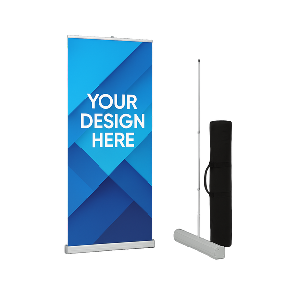
Vertical and Retractable Banners
Vertical formats — standard retractable banner stands are typically 33x80 inches — read top to bottom. The convention for retractable stand design is brand or logo at the top, primary message and key visual in the center where eye level falls at typical indoor viewing, and supporting information or contact details at the bottom. The top third of a retractable banner is visible above the heads of people in a crowded trade show or event space — this area should carry the highest-visibility elements of the design. The bottom third is often obscured by crowds and should carry less critical information.
Step and Repeat Banners
Step and repeat banners are a specialized format where the entire design is a repeating tile of logos or brand names across a backdrop. The key design consideration is the tile size — the repeated logo or element needs to be large enough that at least 1–2 complete repetitions are always visible behind a person standing in front of the banner, regardless of where they position themselves. A tile that is too small creates a busy, illegible background. A tile that is too large means only a partial logo appears in photos. Test the tile size against the expected banner dimensions and the camera distance typical of photos at the event.
Use Margins and Negative Space
Negative space — the empty area around and between design elements — is not wasted space. It is the contrast that makes the content elements visible and distinct. A banner crammed edge to edge with text, logos, and images has no negative space, which means no single element stands out. Maintain a consistent margin of at least 5% of the banner's shortest dimension on all sides, and leave breathing room between text lines and between distinct content sections. The emptier a banner looks in a proof, the more powerful each individual element becomes at actual viewing distance.
Using Images and Graphics on Banners
Images and graphics can significantly enhance a banner's visual impact — or they can overwhelm the message and reduce legibility. The decision to include imagery should be driven by whether the image adds clarity and attention value to the primary message, not by whether space is available to fill.
- Use product or service imagery to instantly communicate what you do: A restaurant banner with an image of a signature dish communicates the business type before anyone reads a word — for businesses where a strong visual cue shortens the cognitive path to understanding the message, a single dominant image is extremely effective
- Never place text directly over a complex image without a contrast layer: Always create contrast separation between text and image backgrounds using a solid color block, a gradient overlay, or a semi-transparent shape behind the text
- Supply images at 150 DPI at actual print size: Images that are adequate resolution for web use are typically insufficient for large-format banner printing — a product image that looks sharp on a monitor will print pixelated at 3 feet wide if the source file is under 150 DPI at print dimensions
- Limit to one primary image: Multiple competing images on a banner create visual complexity that reduces the impact of each individual image — choose the single strongest visual and make it dominant, then let the text do the rest of the work
- Use vector graphics for logos and illustrations: Logos and graphic elements should always be provided as vector files — they scale to any banner size with perfect sharpness, eliminating the pixelation risk entirely regardless of final print dimensions
The Most Common Banner Design Mistakes
These are the mistakes that appear most frequently in banners that fail to generate attention, communicate their message, or represent the business professionally. Most of them are easy to avoid once you know to look for them.
| Mistake | Why It Fails | Fix |
|---|---|---|
| Too much text | Viewer can't process it in 2–3 seconds; all elements compete equally | Cut to one primary message; make all else secondary or remove it |
| Text too small to read at distance | Banner is invisible to its primary audience — vehicle or foot traffic | Apply 1 inch per 10 feet rule; test at actual viewing distance |
| Low contrast colors | Text disappears against background in sunlight or at an angle | Use high-contrast pairings for primary text regardless of brand color |
| Text over a busy photo | Background competes with text; neither reads clearly | Add solid color overlay or text box behind text to create separation |
| Too many fonts | Visual inconsistency reads as amateur; dilutes brand perception | Maximum two font families per banner — one primary, one secondary |
| Low-resolution images or logo | Pixelated output at print size — communicates poor brand quality | Supply vector logos and 150 DPI minimum images at actual print dimensions |
| No clear visual hierarchy | Viewer's eye has no entry point; banner reads as visual noise | Make the most important element significantly larger than everything else |
| Design not tested at viewing distance | Looks great on screen; illegible in the field | Always test at the actual distance the banner will be read from |
| No call to action | Viewer understands the message but has no next step to take | Add a simple, direct action: visit us, call now, scan the QR code |
Including Your Brand Without Cluttering the Design
Every banner is a brand touchpoint, and every impression it generates should reinforce brand recognition as well as deliver the specific message. The challenge is including sufficient branding without compromising the clarity and legibility of the primary message.
Logo Placement and Sizing
Your logo should be present on every banner but should not compete with the primary message for visual dominance unless brand awareness is the sole purpose of the banner. For promotional banners, place the logo in a consistent position — upper left, upper center, or lower right — at a size that is clearly visible but secondary to the primary message. A logo that is too large relative to the message text shifts the viewer's focus to the brand rather than the call to action. Both matter; the message drives the immediate response, the logo builds recognition over time.
Brand Colors as Background and Accent
Using your brand's colors for the banner background, accent bars, and graphic elements creates a cohesive branded appearance without requiring the primary message text to be in a brand color that may not have sufficient contrast. A banner with a navy blue background, white primary message text, and a yellow accent bar — where navy and yellow are the brand colors — looks completely on-brand while maintaining strong text contrast. Brand colors do not have to be the text color to be present and effective in the design.
Contact Information and QR Codes
Website URLs, phone numbers, and QR codes belong on banners where the viewer has time to engage with them — indoor retractable stands, trade show displays, and point-of-sale locations where people stop and look. For outdoor banners on moving vehicles or fast pedestrian traffic, contact information is secondary at best and clutter at worst. Include it at a clearly smaller size than the primary message if the viewing context supports it, and never at a size that competes with the primary call to action. QR codes must be large enough to scan from the expected distance — a QR code smaller than 1.5 inches square is rarely scannable in practice.
Preparing Your Banner File for Print
A well-designed banner can still produce a poor printed result if the file is not prepared correctly. Large-format printing has specific requirements that differ from web design and small-format print production.
- Design at actual print dimensions: Set your canvas to the exact finished size of the banner — if your banner is 4 feet by 8 feet, design at 48 inches by 96 inches, not at a reduced scale
- Set resolution to 100–150 DPI at print size: Large-format banners are viewed from greater distances than small-format prints, which means lower resolution is acceptable — 100–150 DPI at actual print dimensions is standard and sufficient for most banner applications
- Use CMYK color mode, not RGB: Screens display color in RGB; printers use CMYK. Colors — particularly vibrant reds, oranges, and greens — can shift significantly between RGB on screen and CMYK in print. Design in CMYK from the start to see an accurate representation of how colors will print
- Add bleed if required by your vendor: Many banner printers require 0.25 inches of bleed on all sides — background colors and images should extend to the bleed edge so that trimming doesn't leave white borders. Confirm bleed requirements with your vendor before finalizing the file
- Outline all fonts before saving: Convert all text to outlines or paths so that font files are embedded in the design and cannot be substituted by the printer's system
- Submit as PDF, high-resolution PNG, or the format specified by your vendor: PDF preserves vector elements, color profiles, and font outlines in a single file that prints reliably — it is the preferred format for most professional banner printers
If you're not sure whether your file is print-ready, ask your vendor to review it before production begins. A good print vendor will flag resolution issues, color mode mismatches, missing bleeds, and font problems before printing — catching these in pre-press is far less expensive than remaking a banner because a file issue wasn't caught until after production.
Where to Order Custom Banners
Once your design is ready, ordering from a vendor who can deliver consistent color accuracy, sharp print quality, and durable finishing makes the difference between a banner that represents your business professionally and one that undermines it. For custom event banners in a range of sizes and formats, browse the custom event banners collection to see available options and place your order.
Frequently Asked Questions
An effective banner communicates one clear message to someone who wasn't looking for it, in 2–3 seconds, from the distance at which the banner will actually be viewed. The four pillars of effective banner design are: a single primary message, text large enough to read at the installation distance, high contrast between text and background, and a clear visual hierarchy that guides the viewer's eye to the most important element first. Most banner design failures trace back to one or more of these four factors being compromised.
The standard guideline is 1 inch of letter height for every 10 feet of viewing distance. A banner read from 50 feet needs primary text at least 5 inches tall. A banner read from a moving car at 100 feet needs primary text at least 10 inches tall. These measurements are for the printed letters, not the font size in the design file — always verify text size against actual print dimensions, not the font point size shown in your design software. When in doubt, make the text larger than you think you need to — text that seems oversized in a proof is almost always appropriate at the actual installation distance.
The most visible outdoor banner color combinations are high-contrast pairings: black on yellow, white on dark blue or navy, white on red, and yellow on black. These combinations maintain legibility in direct sunlight, from an angle, and in variable lighting conditions. Avoid light text on light backgrounds, text placed over complex photographic backgrounds without a contrast layer, and color combinations that look distinct on screen but blend together at distance — such as dark red on maroon or navy on dark gray. If your brand colors are not naturally high-contrast, use them for the background and accent elements while keeping primary text in a high-contrast color.
As little as possible. A banner read from a moving vehicle or from across a parking lot gets 2–3 seconds of attention. In that time, a viewer can process approximately 5–7 words at legible size. The most effective outdoor banners have 3–7 words of primary message text, a logo, and one secondary detail such as a website or phone number. Every additional word either requires smaller text to fit or pushes something else off the banner. Write out everything you want to communicate, then edit aggressively — the resulting banner will always be more effective than the original version.
For large-format banners, 100–150 DPI at actual print dimensions is the standard. This is lower than small-format print standards because banners are viewed from greater distances, which means fine detail is less critical. However, this resolution must be calculated at the actual print size — not at a reduced preview size. A file that is 300 DPI at 8.5x11 inches is only 25–37 DPI at 4x8 feet, which will print with significant pixelation. Always confirm your resolution at the actual finished dimensions of the banner. Vector files for logos and graphics eliminate this concern entirely by scaling without resolution loss.
Photos can be highly effective on banners when used correctly — a single dominant image that visually communicates what the business does (a plate of food, a finished renovation, a product in use) shortens the cognitive path to understanding the message. The most common mistake with photos on banners is placing text directly over the image without creating contrast separation, which makes both the image and the text harder to read. Always place a solid color overlay or text block behind text that sits over a photo. Photos must also be supplied at sufficient resolution for large-format printing — images pulled from websites or social media are rarely high enough resolution for banner production.
PDF is the preferred format for most professional banner printers because it preserves vector elements, embedded fonts (or outlined text), color profiles, and bleed settings in a single reliable file. High-resolution PNG files at 100–150 DPI at print dimensions are also widely accepted. Avoid submitting JPEG files due to compression artifacts that become visible at large print sizes, and avoid submitting design files in formats that require specific software to open (such as .AI or .PSD) unless your vendor has specifically requested them. Always confirm the accepted file formats with your vendor before finalizing your submission.
Bold, sans-serif fonts are the most legible choice for primary banner text at distance. Fonts like Impact, Bebas Neue, Montserrat Bold, Franklin Gothic Heavy, and similar high-weight display sans-serifs are purpose-built for large-format, high-visibility applications. Avoid thin-weight fonts, highly decorative scripts, or condensed fonts with similar letter shapes — these become difficult to distinguish at distance. Script and decorative fonts can be used for brand names or secondary information that will be read up close, but should never carry the primary message of an outdoor banner.
Trade show banner design follows the same core principles as outdoor banner design with a few key differences. The primary viewing distance at a trade show is typically 10–30 feet, which means text can be smaller than road-facing outdoor signage — but still needs to be legible from across an aisle. Place the most important elements in the top third of a retractable banner stand, where they are visible above the heads of attendees and can attract interest from a distance. The brand name and key message should be instantly clear from across the floor. Secondary details — tagline, website, social handles — belong in the lower half of the design where interested visitors will read them up close. Keep the design clean and uncluttered — a trade show floor is already visually overwhelming, and a simple, bold design stands out more than a complex one.