


Why Design Determines Whether Branded Drinkware Gets Used or Gets Forgotten
Branded drinkware only works as a marketing tool if it gets used. A tumbler that sits in a cabinet, gets regifted, or ends up at a garage sale generates zero impressions — and the brand investment behind it generates zero return. The single most important variable in whether a branded tumbler gets used daily or gets ignored is the design. Quality of the blank and decoration method matter, but design is what determines whether the recipient sees the tumbler as something worth carrying into the world.
People are selective about what they put on their desks, carry in their cars, and use in public. A branded tumbler competes with every other drinkware item the recipient owns — and it wins that competition only if the design is something they are proud to be seen with. That is the design challenge of branded drinkware: create something that functions as a quality branded item for the business while simultaneously being something the recipient genuinely wants to use and display.
The best branded drinkware design achieves two things at once: it communicates the brand clearly to anyone who sees it, and it makes the person holding it feel good about being associated with that brand. When both are true, the tumbler gets used every day. When only the first is true — lots of logo, no lifestyle appeal — it stays in the cabinet. Design for the person holding it, not just for the brand putting its name on it.
Choosing the Right Base Tumbler Color
The color of the tumbler itself — the blank — is the design decision made before a single pixel of artwork is placed. Base tumbler color sets the visual tone for the entire piece, determines how the printed design reads against it, and signals the personality of the brand in a way that artwork alone cannot. Getting the base color right makes every subsequent design decision easier.
Black Tumblers: The Most Versatile Base Color
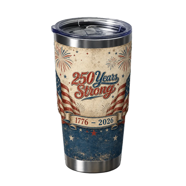
Black is the most universally popular base color for branded tumblers because it works with virtually every design style and communicates quality, sophistication, and versatility simultaneously. On a black base, white and light-colored artwork pops with maximum contrast. Metallic gold and silver designs read as premium. Full-color UV DTF decorations with vibrant artwork look vivid against the dark background without competing color cast from the blank itself. Black tumblers cross demographic and industry lines — they work for a corporate law firm, a luxury brand activation, a fitness studio, and a casual local coffee shop equally well. When in doubt about base color, black is the safest and most reliable starting point.
White and Light-Colored Tumblers: Maximum Design Flexibility
White and light-colored tumblers offer the maximum range of design expression — dark, vibrant, and full-spectrum artwork all show their full color range on a light base without any color shift from the blank underneath. White is particularly effective for designs that use the blank color as part of the composition — negative space elements, illustrations that incorporate the tumbler surface into the design, and photorealistic artwork all benefit from a white or near-white base. Light base colors (soft gray, cream, blush, sage) offer the design flexibility of white with a warmer or more distinctive aesthetic that suits specific brand personalities: wellness brands, boutique retail, artisan food businesses, and lifestyle brands with a soft, organic visual identity.
Color-Matched Tumblers: Brand Identity First
Selecting a base tumbler color that matches or closely coordinates with the brand's primary color palette creates a cohesive, intentional look that communicates strong brand identity even before the printed design is read. A business with a deep navy brand palette on a navy tumbler, or a brand built around forest green on a hunter green blank, communicates visual consistency that feels considered and professional. This approach works best when the brand color is distinctive enough to be recognizable on its own — commodity colors like generic light blue or standard red are less effective for this purpose than distinctive brand-specific hues. When pursuing color matching, confirm the blank color options available in your chosen style before finalizing the design.
Seasonal and Limited Edition Colors
Rotating base colors across seasonal releases is a powerful strategy for businesses that use drinkware as merchandise or recurring gifts. A matte blush or light lavender tumbler for a spring Mother's Day release, a rich burgundy or forest green for the Q4 holiday season, a bright coral or sky blue for summer — seasonal colorways give customers a reason to collect multiple versions and signal that the brand is active, current, and invested in its product. For businesses selling drinkware as merchandise, limited seasonal colorways drive urgency and repeat purchases in ways that a single year-round design cannot.
Design Styles That Work on Branded Drinkware
Not every design style that works in print, on screen, or on apparel translates effectively to a cylindrical drinkware surface. The curvature of the tumbler, the viewing distance from hand to eye, and the way the design wraps around the form all affect how a design reads in use. These are the design styles that consistently produce strong results on branded drinkware.
Bold Typographic Designs
A strong typographic design — the brand name or a short phrase set in a bold, well-chosen typeface — is one of the most legible and brand-effective approaches for drinkware decoration. Large, confident letterforms read clearly from the distances at which branded drinkware is typically seen: across a desk, across a conference table, in a cupholder on a counter. Typographic designs benefit from high contrast between the type color and the base — white type on black, black type on white, gold type on navy — and from typefaces with strong personality that communicate something about the brand character without requiring the viewer to read a tagline. Script and serif typefaces communicate elegance and craftsmanship; bold geometric sans-serifs communicate modernity and confidence; condensed display typefaces communicate energy and edge.
Logo-Centered Designs
For businesses with a strong, well-developed logo, a clean logo-centered design — the mark at a prominent size with the business name and contact information below — is a professional, legible, and widely effective approach. The key variables are logo scale and placement: the logo should be large enough to read clearly without the tumbler being held at close range, and centered or placed in the visual sweet spot of the decoration area (typically the front face of the tumbler, centered between the top and bottom of the decoration zone). Logo-centered designs work best when the logo itself has strong visual character — a compelling mark or wordmark that carries visual interest on its own. Logos that are primarily text-based with little graphic character benefit from supplementary design elements to give the decoration visual energy beyond the name alone.
Illustrated and Graphic Designs
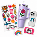
Custom illustrations and original graphic artwork on drinkware create a piece that feels like merchandise rather than a promotional item — which is the design goal for any branded drinkware that is meant to be used rather than filed. An illustrated cityscape for a local business, a botanical illustration for a wellness brand, a bold mascot graphic for a sports team, or a character illustration for a creative brand all give the tumbler visual personality that the recipient wants to display. Illustrated designs benefit from a coherent visual style that aligns with the brand's existing aesthetic — the illustration should feel native to the brand, not like a generic stock art purchase. For businesses without an in-house illustrator, commissioning a single strong illustration for the drinkware program is one of the highest-ROI design investments in the category.
Wrap-Around Designs
A wrap-around design — artwork that extends continuously around the full circumference of the tumbler rather than a centered panel on one face — uses the full decorative surface and creates a visual experience that changes as the tumbler rotates. Wrap designs work particularly well for landscape scenes, botanical patterns, geometric patterns, and brand world-building artwork that rewards close examination. They also maximize the brand impression opportunity: regardless of which direction the tumbler is facing, branded design is visible. The technical requirement for wrap designs is that the artwork be prepared at the correct dimensions to wrap seamlessly — the left and right edges of the design must connect without a visible seam at the join point.
Minimal and Clean Designs
A minimal design — a single wordmark, a simple geometric mark, or a restrained two-element composition — communicates confidence and quality precisely because it doesn't try to fill every available surface. In a market where many branded drinkware pieces are over-designed with too much information competing for visual attention, restraint reads as premium. Minimal designs work best on high-quality blanks where the material itself contributes to the overall impression: a matte black tumbler with a small white wordmark in a refined typeface communicates luxury without requiring complex artwork. The risk of minimal design is appearing blank or unfinished — the single element that does appear must be strong enough to carry the entire visual weight of the piece.
Color Palettes That Work for Branded Drinkware Design
Color palette decisions in drinkware design affect legibility, brand association, and how the finished piece reads at the distances and lighting conditions it will typically be seen in. These are the palette approaches that consistently produce strong results.
| Color Palette | Visual Effect | Best Brand Types | Base Color Pairing |
|---|---|---|---|
| White on black | Maximum contrast — clean and bold | Corporate, tech, fitness, streetwear | Black tumbler |
| Gold on black or navy | Premium and sophisticated | Luxury, hospitality, real estate, legal | Black or navy tumbler |
| Full color on white | Vibrant — full design range visible | Creative, retail, food, lifestyle brands | White or light tumbler |
| Brand color on white | Clean and brand-consistent | Any brand with a strong primary color | White tumbler |
| Tonal / monochromatic | Subtle and refined — design-forward | Wellness, spa, premium retail, minimalist brands | Color-matched tumbler |
| Neon or high-saturation | High energy — visually arresting | Events, nightlife, youth-focused brands, sports | White or black tumbler |
| Earth tones and naturals | Warm and approachable — organic feel | Coffee shops, food, outdoor, wellness, artisan | Cream, tan, or matte sage tumbler |
| Black and white with one accent color | Graphic and sophisticated | Architecture, design studios, professional services | White or black tumbler |
What Information to Include in a Branded Drinkware Design
Every element included in a branded drinkware design competes for visual space and attention. The most effective designs are those that include only what is essential and render each element at the scale it deserves. These are the decisions to make deliberately.
- Business or brand name — always: The name is the most important element on any branded drinkware piece; it should be the largest and most prominent text element in the design, legible without close inspection, and positioned so it is always visible regardless of how the tumbler is oriented
- Website or phone number — for marketing pieces: For drinkware given as a marketing tool — client gifts, trade show giveaways, customer appreciation items — include the website URL or phone number in a secondary text treatment below the name; someone who sees the tumbler needs a direct path back to the business
- Logo mark — where it adds visual value: Include the brand logo mark when it has strong visual character that contributes to the design; omit it or render it very small when it would clutter the composition without adding meaningful brand recognition beyond what the wordmark already provides
- Tagline — only if it's short and adds meaning: A tagline of 4–6 words that communicates a genuine value proposition or brand personality is worth including; a tagline that is generic ("Quality You Can Trust"), too long, or too small to read at normal viewing distance should be omitted rather than cluttering the design
- Social handle — situationally: For brands where social media following is a core business objective — influencer brands, consumer product businesses, experience-based businesses — a social handle (@brandname) adds a low-friction discovery path; for B2B and service businesses where social following is incidental, it is usually better replaced by the website URL
- Personalization — for gift pieces: For individual client gifts, closing gifts, event favors, and personalized merchandise, including the recipient's name, a meaningful date, or a personal message transforms a branded item into a keepsake; design the template so personalization integrates naturally into the composition rather than being appended awkwardly to a generic branded design
Design Style Recommendations by Business Type
The most effective branded drinkware design reflects the personality of the specific brand and resonates with the specific audience receiving it. These are design direction recommendations for the most common business types that use branded drinkware.
Corporate and Professional Services
Clean, restrained designs that communicate quality and credibility without visual noise. A bold wordmark in a refined typeface, white or gold on black or navy, with the website URL in a secondary treatment below. Avoid excessive graphic elements that feel informal — in professional services, the drinkware is a brand ambassador in boardrooms, client offices, and executive environments where visual restraint reads as sophistication. The blank quality matters more in this context than in almost any other — a cheap tumbler with a great design still communicates cheap to a discerning professional audience.
Coffee Shops, Cafes, and Food Businesses
Illustrated or typographic designs with warmth and character — botanical illustrations, vintage-inspired lettering, ingredient artwork, local landmark illustrations, or a strong hand-lettered wordmark. Earth tones, cream bases, and warm neutrals align with the aesthetic language that coffee and food culture has established. The best food business drinkware looks like something purchased at a boutique coffee shop rather than a corporate giveaway — it has personality, visual craft, and a lifestyle quality that makes people want to carry it in public as an expression of their taste.
Fitness Studios and Gyms
Bold, energetic designs that communicate motivation and community identity. Strong typographic statements — a gym motto, a training philosophy, a community name in a display typeface — on dark bases with high-contrast white or color-accent type. Geometric graphic elements, athletic iconography, and high-saturation accent colors work in the fitness context in ways they don't in corporate environments. Fitness drinkware is carried visibly — to gyms, trails, and sports facilities — so the design should communicate something about the culture and identity of the community, not just the logo of the business.
Salons, Spas, and Wellness Brands
Soft, refined designs that communicate calm, quality, and care. Blush, sage, white, and muted natural palettes on light-colored bases with delicate script or refined sans-serif typography. Floral or botanical elements, minimal line illustrations, and restrained compositions align with the wellness brand language that clients of these businesses recognize and respond to. Avoid high-contrast black-and-white approaches that feel clinical or corporate — the wellness context calls for warmth, softness, and a sense of considered curation that extends from the service environment to the branded product.
Events, Nightlife, and Entertainment
High-energy, visually arresting designs built for the photography-first environment of events and nightlife. Bold graphic compositions, neon or metallic accent colors on dark bases, and designs that photograph well under mixed event lighting — which means designs with high internal contrast that hold up whether the photo is taken under stage lighting, flash photography, or ambient candlelight. Event and nightlife drinkware often functions as a collectible as much as a functional item — attendees keep event tumblers as mementos of specific occasions, which means the event name and date are often worth including alongside the brand identity.
Branded Drinkware Design Mistakes to Avoid
Most branded drinkware design failures fall into a small number of repeating categories. Recognizing these patterns before placing an order prevents the most common and costly mistakes.
| Mistake | Why It Fails | What to Do Instead |
|---|---|---|
| Low-resolution logo | Prints blurry or pixelated — communicates amateur brand quality | Use vector files (SVG, AI, EPS) or 300 DPI PNG minimum |
| Too much text | Text too small to read; design looks cluttered and amateurish | Include only name, contact info, and one supporting element maximum |
| Poor contrast between design and base | Design disappears against the tumbler color — low visibility at distance | Ensure sufficient value contrast; test against the actual base color |
| Designing flat without accounting for curvature | Elements at the edges of the design wrap around the tumbler and distort or become less legible | Keep critical elements (name, contact info) in the center zone of the decoration area |
| Using colors as they appear on screen | RGB screen colors can appear differently when printed — particularly neons and very saturated hues | Request a physical proof or color sample before a large run |
| Generic clip art or stock illustrations | Communicates lack of brand investment; indistinguishable from competitors using the same stock | Commission original artwork or use a strong typographic design instead |
| No care instructions provided | Customers wash decorated tumblers in the dishwasher, degrading the decoration — then associate the quality failure with the brand | Always include a hand wash only care card — mild soap, no dishwasher |
How to Order Branded Drinkware With Your Design
With a strong design direction established, the ordering process determines how closely the finished product matches the vision. These steps produce the best results consistently.
Choose the Right Blank First
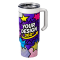
The blank — the undecorated tumbler — determines the quality ceiling of the finished product regardless of how good the design is. Choose a blank with the right size (20oz is the most versatile and popular), the right base color for the design, and a quality level appropriate for the end use. A $5 blank tumbler is not an appropriate vehicle for a premium client gift; a $15–$20 quality blank is. The blank also determines the available decoration area, the surface finish (matte vs. gloss), and how the base color interacts with the printed design. Confirm blank specifications before finalizing the design.
Use the Custom Tumbler Designer to Preview Your Design
Before placing an order, use Tawgraphix's custom tumbler designer to preview how the design looks on the actual blank — the interactive preview shows how the artwork wraps around the tumbler form and how the design reads at the correct scale. Catching proportion, contrast, and placement issues in the design preview stage costs nothing to fix. Catching them after production has run is expensive and time-consuming. For personalized orders and small batches, the tumbler designer also allows individual customization per unit without setup fees. Browse all available styles and sizes in the custom drinkware collection.
Prepare Your Artwork Files Correctly
Submit artwork as vector files (SVG, AI, or EPS) for logo-based and typographic designs — vector files scale to any size without quality loss and produce the sharpest possible printed output. For illustration and photographic artwork, submit PNG or PDF files at 300 DPI at the actual print dimensions. Ensure all text is outlined or embedded so fonts render correctly regardless of the production system. Colors should be specified in the artwork file — if exact brand color matching is important, provide Pantone or CMYK values alongside the artwork file for reference.
Include a Care Card With Every Order
Every branded tumbler order — whether it is a client gift, a trade show giveaway, a retail merchandise item, or an event favor — should be accompanied by a hand wash only care card. Hand washing with mild soap and warm water preserves the UV DTF decoration quality for years. Dishwasher use — the high heat, harsh detergents, and mechanical agitation of a dishwasher cycle — is the primary cause of premature decoration failure on custom drinkware, and customers who are not told how to care for the piece will default to dishwasher use. A care card is a two-dollar investment that protects a twenty-dollar product and keeps the brand impression quality high for the lifetime of the tumbler.
Frequently Asked Questions
The most universally effective branded tumbler color combination is white or light-colored artwork on a black base — maximum contrast, works with virtually every design style, and communicates quality across demographic and industry lines. For premium and luxury positioning, gold or metallic designs on black or navy read as sophisticated and high-value. For brands with a strong primary color identity, a color-matched base tumbler with a contrasting design creates a cohesive brand statement. For maximum design flexibility and vibrant full-color artwork, a white base shows the full color range without any shift from the blank color underneath. The key principle across all combinations is contrast — the design must be visibly distinct from the base color at the distances at which the tumbler will typically be seen.
The best design style is the one that aligns with the brand's visual identity and resonates with the specific audience receiving the drinkware. Bold typographic designs work well across almost all contexts because they prioritize name legibility and communicate brand character through typeface choice. Illustrated designs are highly effective for food, lifestyle, and community-oriented brands where a visual personality is part of the brand identity. Logo-centered designs work when the logo mark itself has strong visual character. Minimal designs communicate premium quality when executed well. The consistent principle across all styles is that the design should make the person holding the tumbler feel good about being seen with it — which requires that the design have genuine visual merit beyond simply placing a logo on a cylinder.
Include both, but prioritize the business name as the most prominent element. The business name, set large and in a strong typeface, is what creates brand recall in everyone who sees the tumbler — including people who have never encountered the brand before and have no context for the logo mark. The logo reinforces visual identity for people who already know the brand. For businesses with a logo mark that is more recognizable than the name — think iconic symbols at major brands — leading with the mark makes sense. For most small and medium businesses where the name recognition is the primary goal, the name should be the dominant design element and the logo mark should play a supporting role.
Premium-looking branded drinkware comes from four factors working together: a quality blank, a clean and considered design, high-quality decoration, and appropriate care instructions. Start with a quality blank — the tumbler itself communicates quality before the design is read. Design with restraint — less visual clutter reads as more considered and confident. Use UV DTF decoration for full-color vibrancy and a finish that holds up over time. Include a hand wash only care card so the recipient knows how to preserve the decoration quality — a care card is a small touch that signals attention to quality that cheap promotional products never include. The combination of a good blank, a strong design, quality decoration, and a care card creates a piece that reads as genuinely premium because it is.
UV DTF decoration supports unlimited colors — there is no per-color cost or color count restriction as there is in screen printing. This means full-color photographic artwork, gradient fills, and complex illustrated designs with dozens of colors are all equally achievable at the same cost as a single-color design. The practical design advice is not about color count but about palette cohesion: 2–4 intentional colors in a coordinated palette produce a more professional result than 8 colors used without a unifying principle. Use as many colors as the design genuinely requires, but choose them deliberately and ensure they work together as a palette rather than competing for visual attention independently.
For logo-based and typographic designs, submit vector files — SVG, AI, or EPS — which scale to any size with perfect sharpness regardless of the print dimensions. For illustrated and photographic artwork, submit a high-resolution PNG or PDF at 300 DPI at the actual print size. The most common artwork error is submitting a logo that exists only as a low-resolution raster file — a PNG that looks sharp on screen at 500 pixels wide may print with significant pixelation at 4 inches wide on a tumbler. If your logo only exists in low-resolution format, request vector conversion from a designer before placing the order. Use the custom tumbler designer to upload your artwork and preview how it looks on the tumbler before finalizing the order.
Hand wash only with mild soap and warm water — this is the single most important care instruction for any decorated tumbler. Dishwasher use is the primary cause of premature decoration failure: the high heat, harsh detergents, and mechanical agitation of a dishwasher cycle degrade UV DTF decoration significantly faster than hand washing. A tumbler that is hand washed consistently can maintain decoration quality for years and dozens of washes. A tumbler run through a dishwasher regularly may show fading, peeling, or adhesion failure within weeks or months. Always include a hand wash care card with every branded tumbler given as a gift, giveaway, or retail purchase — it is the single most effective step a brand can take to ensure the recipient's experience of the product reflects the quality of the decoration.